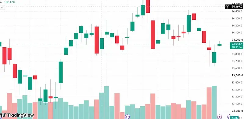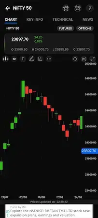
Technical Analysis for Beginners
Learning Technical Analysis does not begin with complicated indicators or advanced trading strategies. It begins with understanding the price chart.
Before learning Support and Resistance, Market Structure, Breakouts, Candlestick Patterns, or Intraday Trading Strategies, you should first understand what a chart is telling you.
The foundation of Technical Analysis is learning how to identify:
- Price
- Timeframe
- Open
- High
- Low
- Close
- Candlestick
- Candle Body
- Upper Wick
- Lower Wick
- Volume
- Previous Close
- Gap Up
- Gap Down
- Recent High
- Recent Low
- Buyer and Seller Strength
This is Level 1: Chart Basics.
The objective at this stage is not to predict the market or immediately take trades. Your first goal is to observe and understand what price is doing.
READ MORE: https://marketmantra2026.in/how-does-technical-analysis-work-in-the-stock-market/ https://twitter.com/Realfinancial2/status/2094683498476970421?s=20
What Is Technical Analysis?
Technical Analysis is a method of studying market data, particularly price and volume, to understand market behaviour and identify potential trading opportunities.
In simple words:
Technical Analysis = Understanding Price + Volume + Time
For example, suppose Nifty 50 moves from 24,000 to 24,300.
A beginner might simply say:
“Nifty is up 300 points.”
But a Technical Analyst will ask:
- Where did the market open?
- What was the day’s high?
- What was the day’s low?
- Where did it close?
- Were buyers stronger than sellers?
- Was volume high or low?
- Did the market open with a gap?
- Where was the previous close?
- What are the recent highs and lows?
These questions help us understand the story behind the price movement.
What Is a Price Chart?
An stock price as it fluctuates over time is shown visually in a chart.
A basic chart has two important components:
Horizontal Axis = Time
Vertical Axis = Price
For example:
Price
250 ┤                    ●
240 ┤               ●
230 ┤          ●
220 ┤     ●
210 ┤ ●
    └────────────────────────
              Time
The chart allows us to visually study whether price is:
- Moving upward
- Moving downward
- Moving sideways
- Making higher prices
- Making lower prices
- Rejecting certain price levels
What Is OHLC?
One of the first concepts you should learn is OHLC.
OHLC stands for:
O = Open
H = High
L = Low
C = Close
These four prices provide the basic information about a candle.
Open
The price at which the selected period begins.
High
The highest price reached during that period.
Low
The lowest price reached during that period.
Close
The price at which the selected period ends.
Example of OHLC
Suppose a 5-minute Nifty candle has:
Open = 24,000
High = 24,080
Low = 23,970
Close = 24,060
This tells us:
- Market opened at 24,000
- Price moved down to 23,970
- Price moved up to 24,080
- Market finally closed at 24,060
So one candle gives us a small story about what happened during those five minutes.
What Is a Candlestick?
A candlestick is a visual representation of price movement during a particular period.
The timeframe determines how much time one candle represents.
For example:
1-Minute Chart
One candle represents 1 minute of price activity.
5-Minute Chart
One candle represents 5 minutes.
15-Minute Chart
One candle represents 15 minutes.
1-Hour Chart
One candle represents 1 hour.
Daily Chart
One candle generally represents one trading day.
Every candle contains the basic OHLC information.
Parts of a Candlestick
A basic candlestick has three main visual components:
1. Body
The body represents the distance between the Open and Close.
2. Upper Wick
The line above the body is called the Upper Wick or Upper Shadow.
It shows how high the price travelled during that period.
3. Lower Wick
The line below the body is called the Lower Wick or Lower Shadow.
It shows how low the price travelled during that period.
Understanding the body and wicks is essential because they provide clues about buying and selling behaviour.
What Is a Bullish Candle?
A candle is generally considered bullish when:
Close > Open
Example:
Open = ₹100
High = ₹110
Low = ₹98
Close = ₹108
The market opened at ₹100 and closed at ₹108.
Therefore, it is a bullish candle.
A bullish candle generally indicates that buyers were relatively stronger during that selected period.
However, remember:
One bullish candle does not automatically mean the market is bullish.
You must consider the surrounding candles, trend, price level, volume and market structure.
What Is a Bearish Candle?
A candle is generally considered bearish when:
Close < Open
Example:
Open = ₹110
High = ₹112
Low = ₹98
Close = ₹100
The market opened at ₹110 and closed at ₹100.
Therefore, it is a bearish candle.
A bearish candle generally indicates that sellers were relatively stronger during that selected period.
But again:
One bearish candle is not automatically a SELL signal.
Context matters.
How to Read Candle Body Size
The size of the candle body can provide information about the strength of the price movement.
Large Body
A relatively large body indicates that price made a stronger directional move during that period.
For example:
Open = ₹100
Close = ₹115
This gives a 15-point body.
Small Body
A small body means the Open and Close were relatively close.
For example:
Open = ₹100
Close = ₹102
This may indicate weaker directional movement or greater indecision.
However, body size should never be used alone to make a trading decision.
How to Read the Upper Wick
Suppose:
Open = ₹100
High = ₹120
Close = ₹105
The price moved from ₹100 to ₹120 but eventually closed at ₹105.
This creates a noticeable upper wick.
A basic observation would be:
Price moved to higher levels but was pushed back down before the candle closed.
This can provide a clue about selling pressure or rejection at higher prices.
But an upper wick alone is not a guaranteed SELL signal.
We need to consider where that candle appeared and what the surrounding price action looks like.
How to Read the Lower Wick
Suppose:
Open = ₹100
Low = ₹80
Close = ₹98
The price fell to ₹80 but then recovered and closed at ₹98.
This creates a noticeable lower wick.
A basic observation would be:
Price moved to lower levels but buyers pushed it back upward.
This can provide a clue about buying interest at lower prices.
But a lower wick alone is not a guaranteed BUY signal.
What Is a Timeframe?
A timeframe tells you how much time is represented by one candle.
Common timeframes include:
| Timeframe | One Candle Represents |
|---|---|
| 1M | 1 minute |
| 3M | 3 minutes |
| 5M | 5 minutes |
| 15M | 15 minutes |
| 30M | 30 minutes |
| 1H | 1 hour |
| 4H | 4 hours |
| 1D | 1 day |
| 1W | 1 week |
| 1 Month | 1 month |
Timeframe selection is extremely important because the same market can look completely different on different timeframes.
Why Are Different Timeframes Important?
Suppose Nifty moves from 24,000 to 24,500.
On the Daily chart, the market may appear strongly bullish.
On the 15-minute chart, you may see a temporary correction.
On the 5-minute chart, you may see many small upward and downward movements.
Therefore:
Higher Timeframe = Broader Market Picture
Lower Timeframe = More Detailed Price Movement
For intraday trading, traders often analyse multiple timeframes rather than relying on only one chart.
We will study Multi-Timeframe Analysis in a later level.
What Is Volume?
Volume represents the amount of trading activity during a particular period.
On most charts, volume appears as vertical bars below the price chart.
For example:
Volume

       █
       █
 █     █
 █  █  █
 █  █  █
────────────
A larger volume bar generally means there was more trading activity during that period compared with a smaller volume bar.
Volume can become particularly useful when combined with price.
How to Read Price and Volume Together
Instead of looking at volume separately, study it alongside price.
Price Rising + Volume Rising
Price is moving upward while trading activity is increasing.
This can provide stronger confirmation of the upward move.
Price Rising + Volume Falling
Price is moving upward but volume is decreasing.
This may require more caution because participation may be weaker.
Price Falling + Volume Rising
Price is declining while trading activity is increasing.
This can provide a clue about stronger selling participation.
Remember:
Volume is a confirmation tool, not a guaranteed BUY or SELL signal.
What Is Previous Close?
Previous Close is the closing price of the previous trading session.
Example:
Monday’s closing price:
₹500
Therefore, Tuesday’s Previous Close is:
₹500
If Tuesday’s current price is ₹520:
₹520 > ₹500
The current price is above the previous close.
If the current price is ₹480:
₹480 < ₹500
The current price is below the previous close.
Previous Close can be an important reference point for intraday traders.
What Is a Gap Up?
A Gap Up occurs when a market opens significantly above the previous session’s close.
Example:
Previous Close = ₹100
Next Open = ₹108
The market opened ₹8 above the previous close.
Therefore:
Gap Up = ₹8
Gap-ups can occur because of overnight news, global market movements, company announcements and other events that affect market expectations.
What Is a Gap Down?
A Gap Down occurs when the market opens below the previous session’s close.
Example:
Previous Close = ₹100
Next Open = ₹93
The market opened ₹7 below the previous close.
Therefore:
Gap Down = ₹7
Gap Up and Gap Down are particularly useful observations for intraday traders because the opening location can influence the day’s price behaviour.
How to Identify Current Price
The current price is the latest available market price.
Suppose:
Current Price = ₹24,500
The first thing you should learn to do is simply identify where the current price is on the chart.
Then compare it with important reference points such as:
- Previous Close
- Today’s Open
- Recent High
- Recent Low
Do not immediately decide whether to BUY or SELL.
First understand where price is located.
How to Identify Recent High and Recent Low
Look toward the left side of the chart and identify recent turning points.
Suppose:
Recent High = ₹500
Recent Low = ₹470
Current Price = ₹490
Your basic observation should be:
Current price is closer to the recent high than the recent low.
At this stage, do not automatically call ₹500 resistance or ₹470 support.
Later, when you study Support and Resistance, you will learn how to properly determine whether a level is acting as support or resistance.
How to Identify Buyers and Sellers
One of the most important skills in Technical Analysis is understanding whether buyers or sellers appear stronger.
Suppose you see:
- Several strong bullish candles
- Higher closes
- Price moving toward higher levels
- Relatively strong volume
- Small pullbacks
The basic observation can be:
Buyers appear relatively stronger.
Now consider the opposite:
- Several strong bearish candles
- Lower closes
- Weak upward bounces
- Increased selling activity
The basic observation can be:
Sellers appear relatively stronger.
This is a probability-based observation, not a guarantee.
How to Read the Story of a Candle
This is one of the most important skills you should develop.
Suppose:
Open = ₹100
High = ₹120
Low = ₹95
Close = ₹115
Do not simply say:
“This is a green candle.”
Instead, read the story:
The market opened at ₹100. Sellers initially pushed the price down to ₹95. Buyers then entered and pushed the price up to ₹120. The market finally closed at ₹115. Since the close was above the open, the candle was bullish, and the close was near the upper part of the candle’s range.
This is the beginning of real chart reading.
Complete Chart Reading Example
Suppose Nifty has:
Previous Close = 24,400
Today’s Open = 24,500
Therefore, the market opened with a Gap Up.
Now the current price is:
24,540
The first 5-minute candle has:
Open = 24,500
High = 24,560
Low = 24,480
Close = 24,550
And suppose the volume is higher than the previous few candles.
Now make your observations:
Observation 1
The market opened above the previous close.
Observation 2
The market opened with a Gap Up.
Observation 3
The candle is bullish because:
Close > Open
Observation 4
The close is near the high of the candle.
This suggests relatively strong buying during that candle.
Observation 5
Volume is relatively high.
This provides additional confirmation that trading activity was strong.
Observation 6
Suppose the recent high is 24,600.
The current price of 24,540 is relatively close to that recent high.
Now notice something important:
We still haven’t taken a BUY trade.
Why?
Because Level 1 is about reading the chart, not blindly taking trades.
Before making a trading decision, we need to study:
- Market Structure
- Support
- Resistance
- Breakout
- Retest
- Entry confirmation
- Stop Loss
- Target
- Risk-to-Reward
These concepts will come later.
Common Beginner Mistakes
Mistake 1: Every Green Candle Is a BUY Signal
Wrong.
A green candle only tells you that the candle closed above its open.
Mistake 2: Every Red Candle Is a SELL Signal
Wrong.
A red candle only tells you that the candle closed below its open.
Mistake 3: Using One Candle to Determine the Trend
Wrong.
Trend requires studying multiple price movements and market structure.
Mistake 4: Adding Too Many Indicators
Beginners often add RSI, MACD, multiple EMAs, Bollinger Bands and many other indicators at the same time.
This can make the chart confusing.
First learn to read price.
Mistake 5: Ignoring Volume
Volume can provide useful context for price movements.
Mistake 6: Ignoring Timeframe
A candle can look bullish on one timeframe while the broader market is bearish on a higher timeframe.
Mistake 7: Predicting Too Early
Your first objective should be:
Observe → Understand → Analyse → Decide
Not:
Open chart → BUY
Level 1 Practical Exercise
Open a Nifty 50 5-minute chart.
For now, remove the indicators so you can focus on price.
Study the last 10–20 candles.
For every candle, identify:
- Open
- High
- Low
- Close
- Bullish or Bearish
- Body size
- Upper wick
- Lower wick
- Volume
- Buyer or Seller strength
Then write one sentence describing the candle.
For example:
“Price opened at ₹100, fell to ₹95, buyers entered and pushed the price to ₹108, and the candle closed at ₹106. The candle is bullish and shows recovery from lower levels.”
Do this exercise repeatedly.
The goal is to train your eyes to read price instead of simply looking at candles.
What Should You Be Able to Identify After Level 1?
By the end of Level 1, you should be able to identify:
✅ Timeframe
✅ Current Price
✅ Previous Close
✅ Gap Up
✅ Gap Down
✅ Open
✅ High
✅ Low
✅ Close
✅ Bullish Candle
✅ Bearish Candle
✅ Candle Body
✅ Upper Wick
✅ Lower Wick
✅ Volume
✅ Recent High
✅ Recent Low
✅ Basic Buyer Strength
✅ Basic Seller Strength
✅ The basic story behind a candle
The Level 1 Formula
Whenever you open a chart, follow this sequence:
1. TIMEFRAME
↓
2. CURRENT PRICE
↓
3. PREVIOUS CLOSE
↓
4. GAP UP / GAP DOWN
↓
5. OHLC
↓
6. CANDLE
↓
7. BODY + WICKS
↓
8. VOLUME
↓
9. RECENT HIGH + LOW
↓
10. BUYERS vs SELLERS
↓
11. UNDERSTAND THE PRICE STORY
This is the foundation of Technical Analysis.
Once you can do these things comfortably, you are ready to move to the next stage: Candlestick Patterns.
In Level 2, you will learn important patterns such as Hammer, Shooting Star, Doji, Bullish Engulfing and Bearish Engulfing, along with the more important question: when these patterns are actually useful, when they fail, and how to avoid false signals.